VENUS Cosmetics Brand Identity

Logo

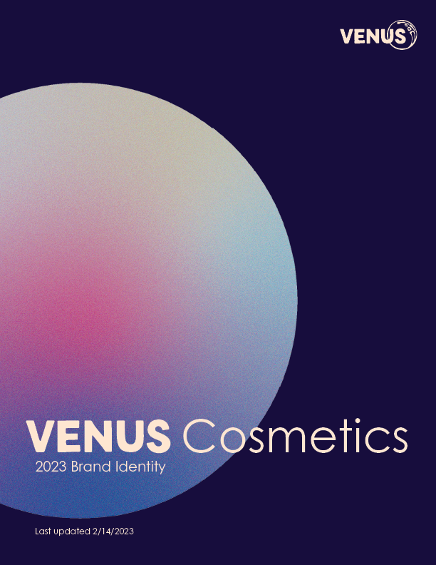
Brand Identity Manual

Click here to view the entirety of the VENUS Cosmetics Identity Manual

Digital

Print

Packaging

About

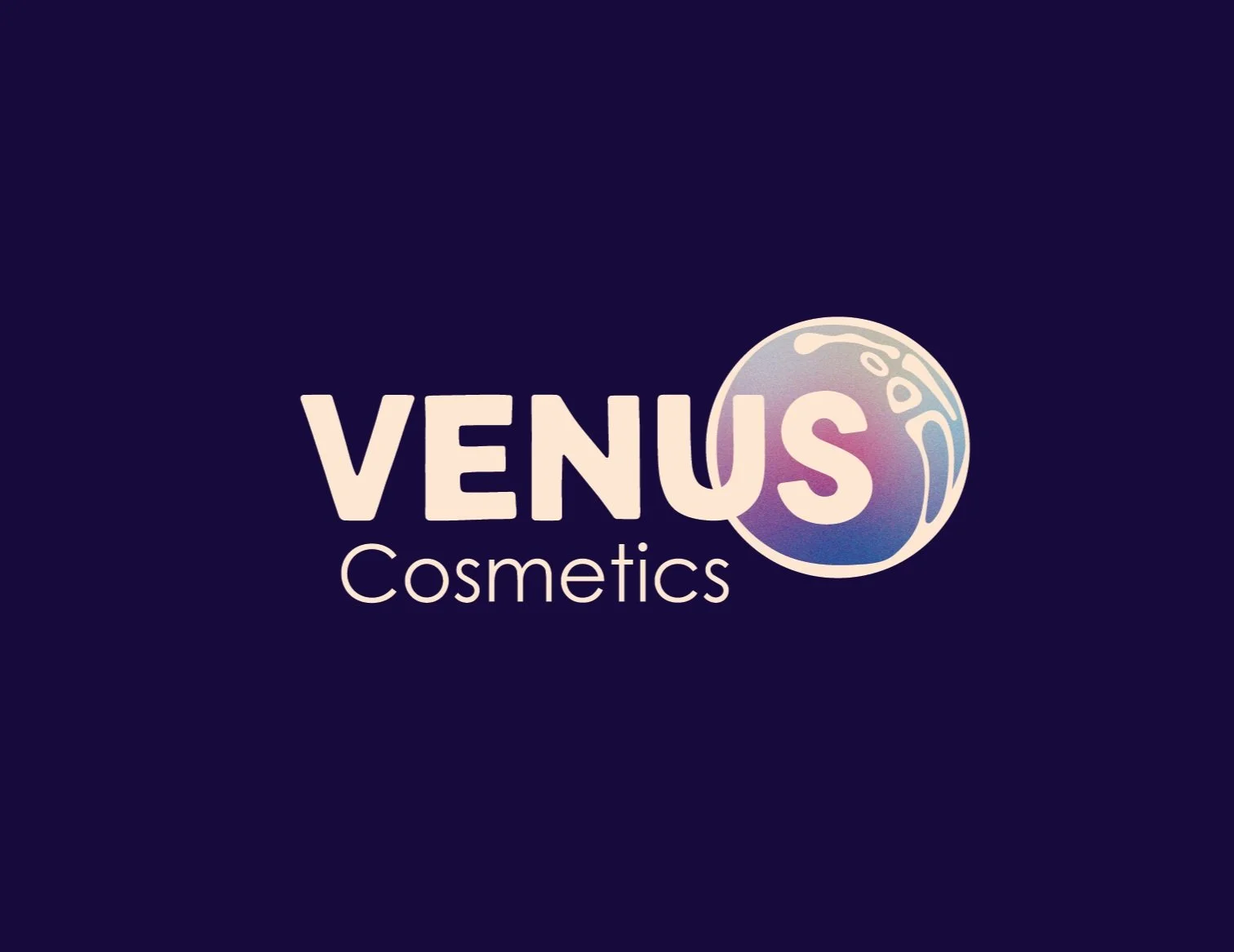
  • The goal was to create a logo and visual identity for VENUS Cosmetics, a sustainable makeup brand. It is important that the brand has a strong wordmark logo as well as an icon, that represented the brands purpose, that could be used together and separate. The visual brand is intended to read as beautiful, ethereal, and divine.

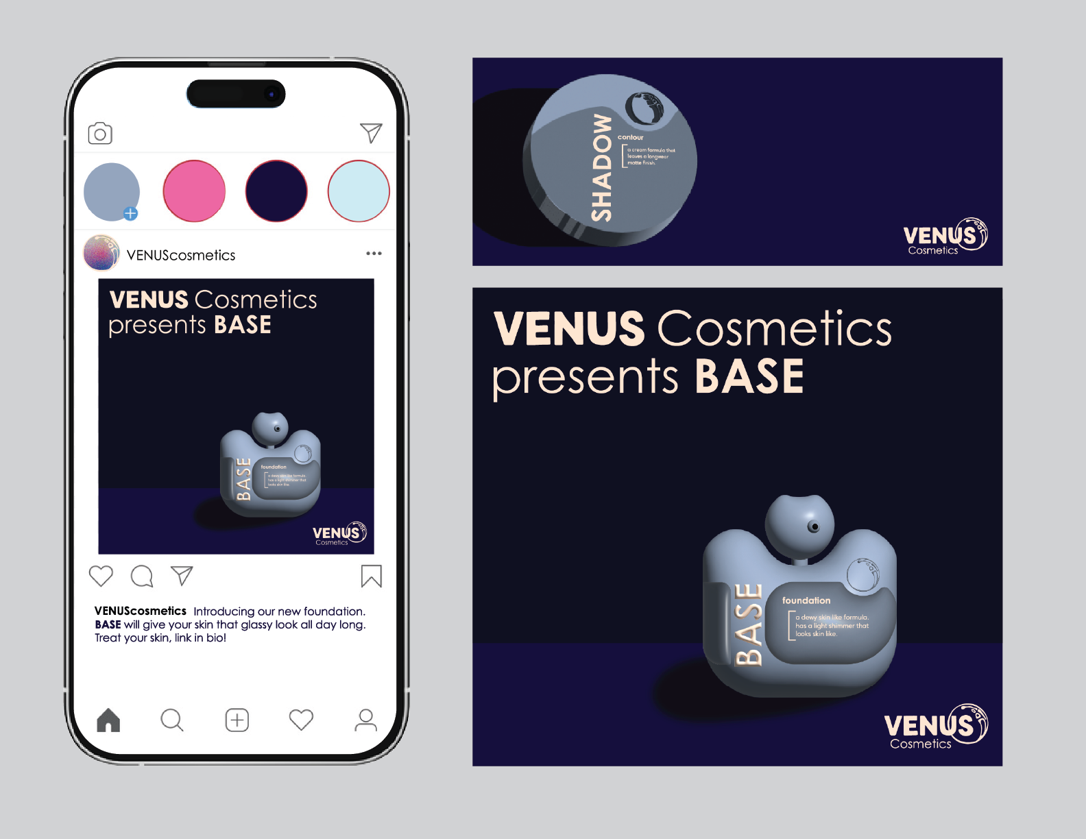
  • I started by putting together a mood board that had inspiration pertaining to the Venus Woman, renaissance paintings of Venus, as well as color and shape inspired by architecture and nature. The logo began with 60 sketched logos that were then digitized. From there one was selected and polished. As I played with a color palette, I simultaneously developed print, packaging, and digital materials so that I could see how the brand rules will play out before establishing them in the identity manual. Once I finished the identity manual, I ensured that all packaging, print, and digital elements were consistent with the manual and logo.

  • The logo is successful in representing the concept of the brand. It uses an all caps, sans serif typeface that sits beautifully overlapping the ORB. The icon in the logo is referred to as the β€œORB”, the mascot for the brand, that represents the source in which the pure, clean, and natural product is derived from. Read through the Brand Identity Manual using the link above for more details about the brand choices.

Previous
Previous

Unlock Health

Next
Next

Restaurant Website Design